UX/UI STRATEGY for IN-product experiences
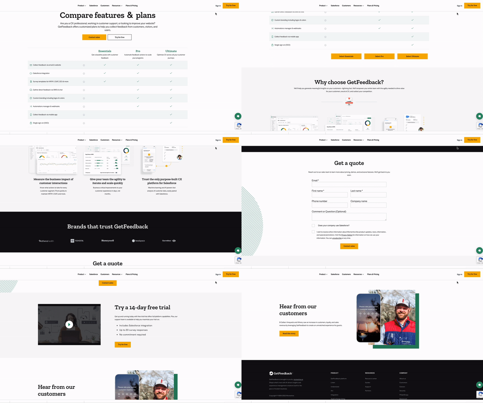
The GetFeedback pricing model was struggling to provide leads and was a poor reference for the sales team’s conversations with prospective customers
After UX and content design optimizations, it earned:
+12% Marketing Qualified Leads (MQLs), Higher Closed:Won rates, +56% qualified opps
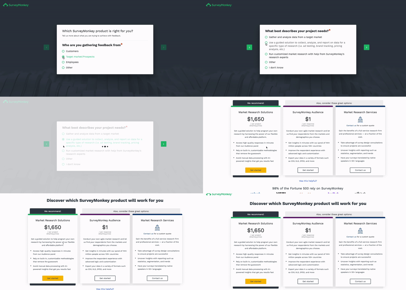
The goal was to take users down a flow of 3 questions to help determine product fit.
84% of users that started going through this flow, finished it
Annual SurveyMonkey plans saw slight increase and Audience product conversions increased 17.6%
Click through rate was fairly low, but users that did go through the flow were likely to become customers after
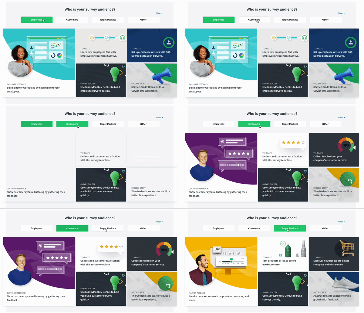
The SurveyMonkey homepage was failing to help users navigate to relevant content. After designing a web component that functioned as a springboard to other parts of the site, we saw success:
Marketing page views +20%, Sign ups +53%, Paid plans directionally higher
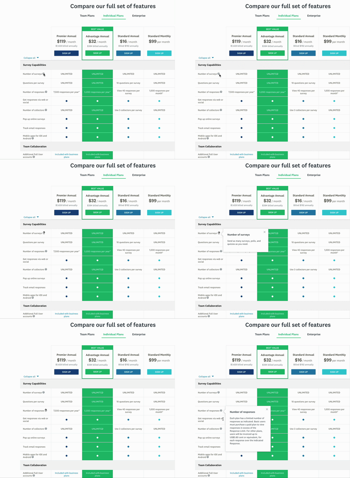
SurveyMonkey has 50+ features for creating, sending and analyzing surveys. These tool tips were created to show users how each feature works and what the benefit of them is.
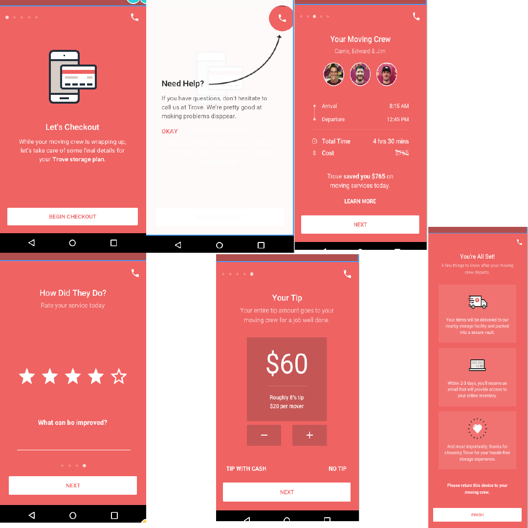
Trove uses technology to help people store their belongings. This is the content strategy created to walk customers through the check out process after their belongings had been picked up, inventoried and moved.
The completed content strategy on the Trove app, walking customers through their checkout process.
Built as an interactive app, SalesFlow is Spruce Finance's tool for quoting their financing options. Through a single credit pull, contractors create a transactional experiences. The app offers multiple financing options, starts the underwriting process and the customer can DocuSign in realtime from any mobile device.
This UI strategy includes product highlights as well as marketing content on the Solar Lease product.
The MySolarCity app includes a toggle to a support section where users can access troubleshooting support for their Powerguide, which monitors solar panel system production and consumption. I worked with the UX and engineering team to craft a more simplified messaging than the troubleshooting guide.
Screenshot of MySolarCity app including environmental calculator which uses same calculation from environmental claim found on FAQ page, blog and social channels.
Wrote (i) modals to show additional content regarding the proposal.
Instructing users to submit their zipcode, placing them in the ecommerce flow.
Worked with the software team to use their API to show social proof, encouraging users to move further into the flow.
Wrote and tested various CTAs for the fork page which encourages user to draw panels on their home in the next step.




To unify Bark’s 4 eCommerce sites onto a single platform, we created a Marketing Design System (MDS) to consolidate all user journeys into a single checkout experience.
Deliverables:, Information architecture, Wireframes & mock ups, New componentry & functionality, Growth test strategy & execution