ECommerce, checkout & shopping carts
BARKBOX FUNNEL & CHECKOUT EXPERIENCE
BEFORE - users had to click through 6-9 different screens to checkout
Business Challenges:
CVR is in decline, dropping by 50 basis points (5 > 4.5%)
Completion rate of Bark’s funnel was less 10% of initiation
Funnel steps vary based on the promotion—it can be as large as 9 steps, each with multiple user tasks and screens
← Existing UX:
80% of Bark’s traffic is mobile, 60% of conversions are driven from paid
1st time a user sees pricing is in the checkout funnel, after 5-6 different steps, including email submission
KPIs:
Conversion rate / subscription completion
Speed to completion
-
Redesigning the funnel into a single-buy page would improve CVR:
Consolidating the funnel would align to UX best practices for user flows and eComm sites
A single buy page matches our other experiences (Barkshop.com & Food.bark.co)
Getting users to checkout faster may help improve CVR
-
Adding pricing EARLIER in the funnel experience (to BarkBox Homepage) will help drive conversions:
Pricing transparency helps us avoid bait & switch
Managing user expectations will help reduce friction in the funnel—less sticker shock
Product-led messaging that communicates the value of the subscription—not the first box—will drive more users into the checkout flow
-
Add new component to the homepage to bring awareness to plans & pricing before funnel to minimize sticker shock
Cut user tasks by 50%
Naturally group steps by what is intuitive to users
Add clarity to language
Show total cost & fees at every step
Clear pagination
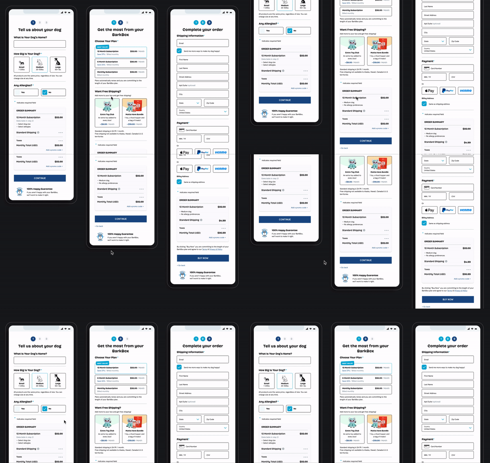
AFTER - Optimized checkout by slimming to 3 screens & adding pricing to homepage
Results:
Conversion rate improved by 7% (stat sig) from previous month
Google started surfacing pricing directly to search results—which wasn’t possible before because users had to sign in before accessing pricing
Funnel completion rate increases by more than 50%
Support cases decreased by more than 15%
BARKBOX PRODUCT GALLERY > CART
before - promo confusion & no happy path to cart
Business Challenge: Bark’s Food site has a 2% CVR, which is 3x less than its Dog Toy business.
Hypotheses:
Silos between product brands are preventing discovery of non-play products
Users lack awareness of how Bark Food products are relevant to their dogs or how convenient it is to purchase from a subscription model
AFTER - clarity on promo & subscription cadence
UX Strategy:
Give “kibble” its own landing page and let users self-discover which product is right for them
Include ingredients & protein in the product name
Improve clarity for bag sizing
Add product reviews
Animate image for more visibility of product (kibble pouring into dog bowl)
Include ingredients on PDP
Results:
+25% increase on “Subscribe & Save”
AOV increased by $2.33
+25% increase on “Subscribe & Save”, AOV increased by $2.33


